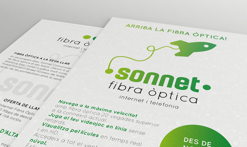
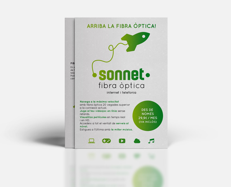
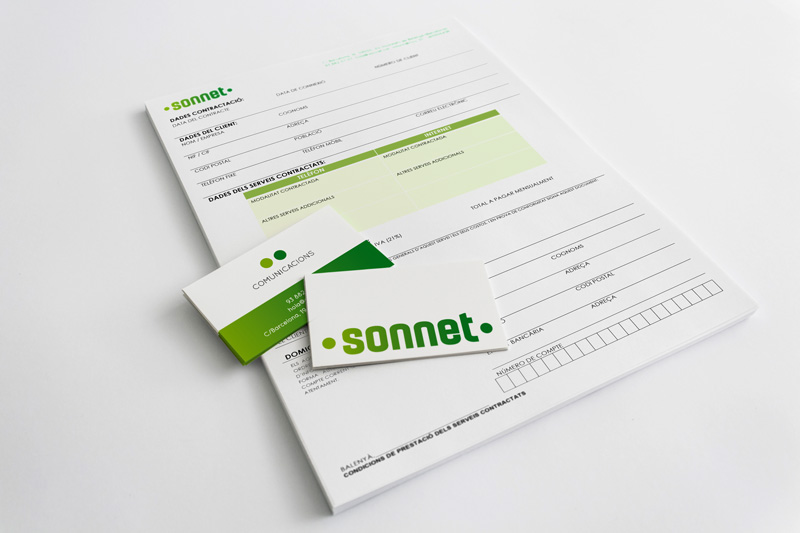
Corporate identity and applications for a new Fibre Optic communications company.
Concept
SONNET is a local based Fibre Optic communications operator. We have worked with the concepts of proximity, quality, connection, technology, light, data, dynamism and movement. The way fibre optic works is: “information–light–light–information”. We have represented this concept with the side-to-side gradient that covers the image. We have chosen green colours to reinforce such concepts as proximity, warmth and rural atmosphere: it is an optical fibre operator with a local radius of action, village and surroundings.